Best overall
Manrope
Clean and expensive-feeling, but a little warmer and more ownable than Inter. It feels especially strong on the homepage and in app/product UI.
Instead of judging type in isolation, this page shows each option across the kinds of surfaces Arclight would realistically use: paid social, landing pages, app UI, direct mail, and outdoor.
My bias is to start with the options that feel premium and contemporary without drifting into “startup font of the month.”
Clean and expensive-feeling, but a little warmer and more ownable than Inter. It feels especially strong on the homepage and in app/product UI.
More sculpted and futuristic without getting theatrical. It gives Arclight some edge while still feeling disciplined and minimal.
Sharper and more expressive than the rest, but still refined enough to test as a possible campaign or hero-led brand voice if you want more personality.
The point here is to see where each font gets better or worse: some shine in giant headlines, others hold up better in utility UI or small CTA text.
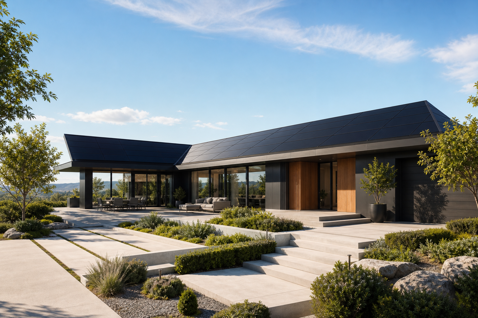
Fast estimate. Real pricing. No calls unless you want one.
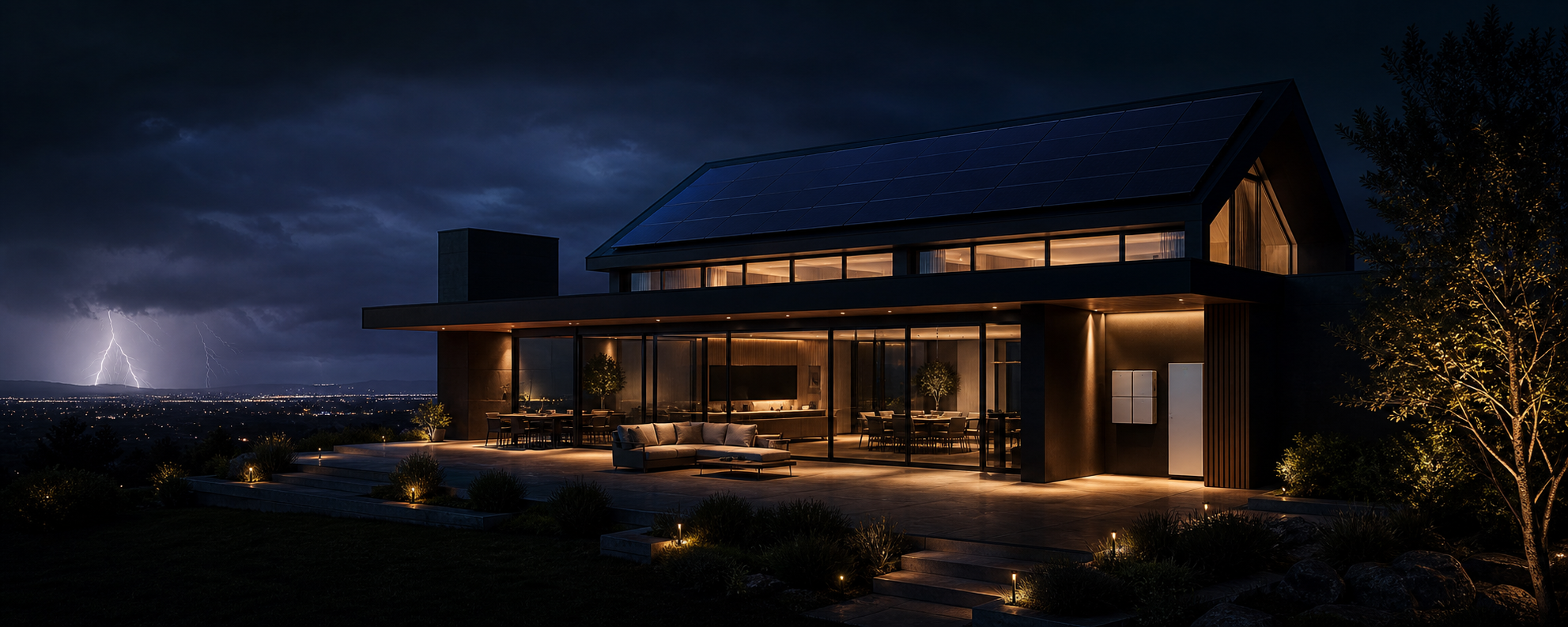
Battery backup that feels like part of the home, not a generator compromise.
Use satellite and utility data to get a clearer solar estimate before talking to anyone.
Arclight gives homeowners a cleaner way to shop for solar: transparent pricing, modern install experience, and an app that stays useful after the job is done.
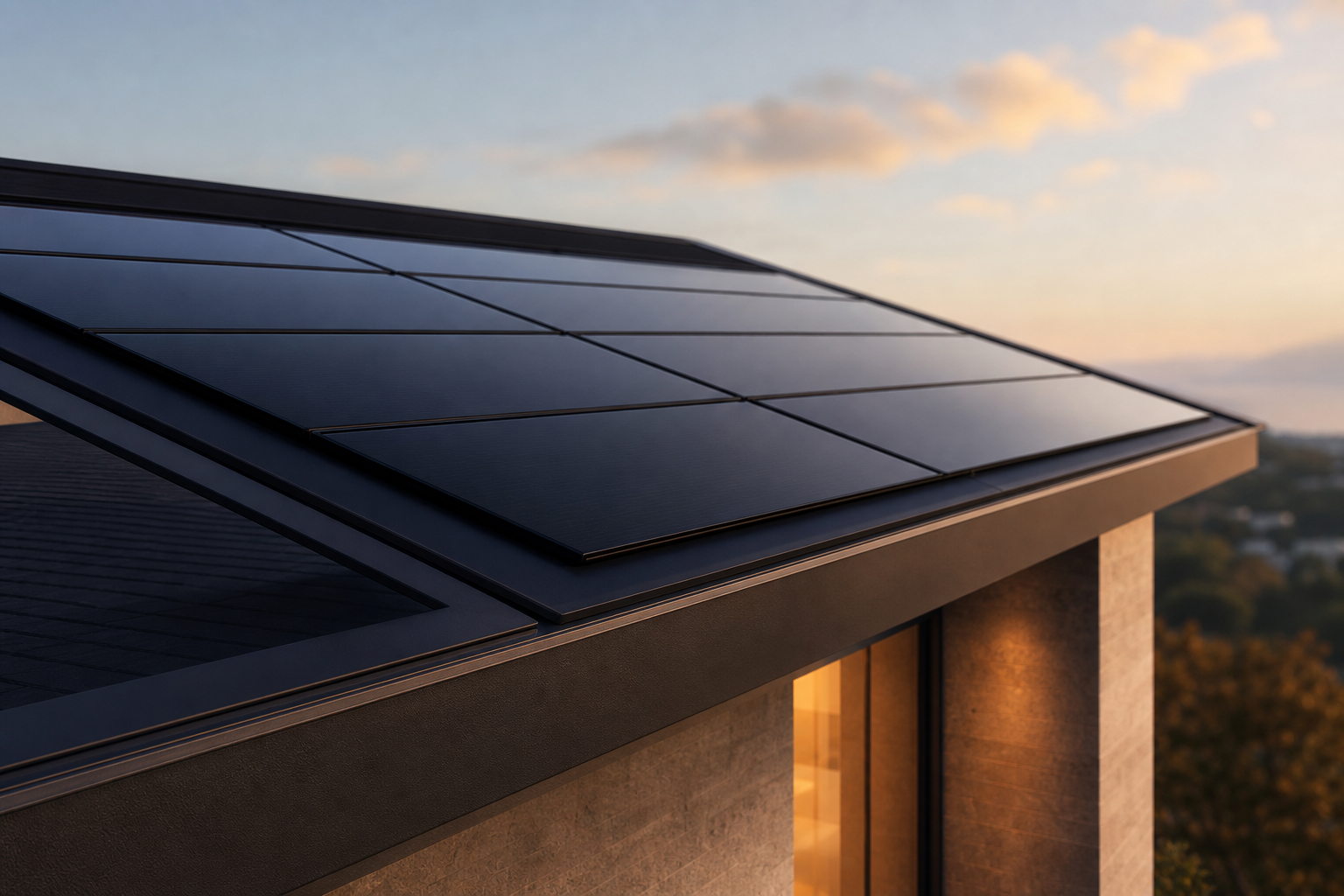
The app should feel calm, premium, and useful. This is a good place to judge whether a typeface feels sharp or merely generic.
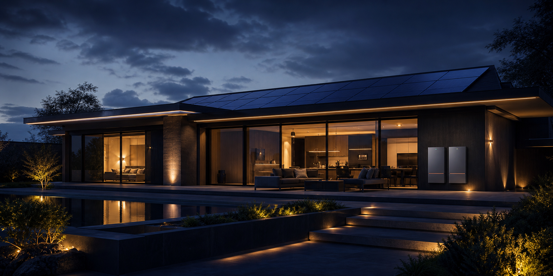
This one is helpful for seeing whether the font can carry a longer, more opinionated brand line without getting clumsy.